The Spectator
.
These programs attempt to combat what Hill calls “students not knowing what Student Assembly is capable of in terms of advocating for the student body.” Hill adds that wants students to see Student Assembly as a “central body” and a medium through which they can express their opinions “a lot more effectively” than choosing to deal with issues individually. He, and the rest of SA, thinks these problems can be solved by increasing the visibility of Student Assembly. Additionally, he says that more visibility will allow student government to have more “agency and legitimacy to speak on behalf of the student body.”
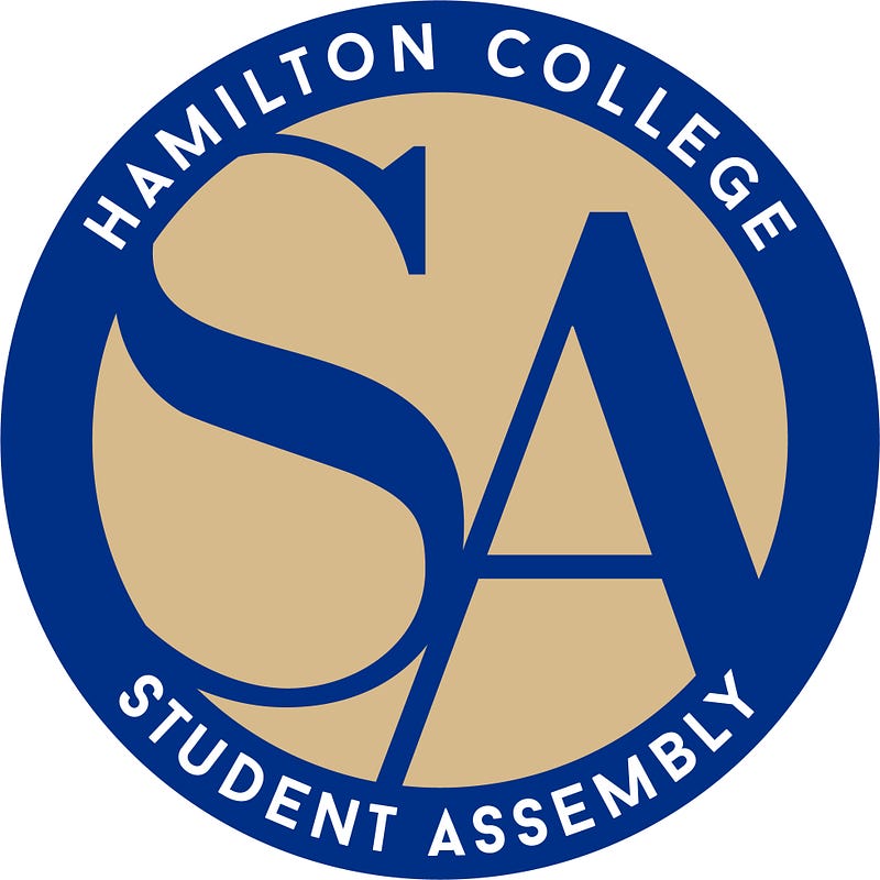
For the next step in SA’s visibility initiatives, the body decided to change its official Student Assembly logo. At the start of the spring semester, SA held a month-long all-campus competition open to anyone who wanted to submit designs for the new logo. 25 were submitted and the list was narrowed down to two options. Student Assembly voted on the new logo at its meeting on Monday, March 4.
The vote between the final two candidates was close, so close that the difference came down to only four SA members. The runner up was a more traditional and regal design featuring a wreath surrounding the logo. The winner, a design created by Aaron Simons ’22, is a more modern design and emphasizes SA’s efforts to represent the community.
It features the stylized letters “SA” in Continental Blue transcribed inside a Buff circle. A Continental Blue ring surrounds the letters with the words “Hamilton College Student Assembly” written inside. Simons said he “felt honored and humbled” when he found out his design had been picked and added “it was really cool to be able to contribute to the school and design something that’s actually going to be used.”
Morgan Perry ’21, Student Assembly’s Publicity Director, sees the logo as “modern, new, and refreshing,” and hopes that it will “make students more engaged in the politics of student government […] and show students that [SA] is a resource with contacts in the administration who are really receptive to student ideas.”
Hill expressed excitement about the new logo, saying, “We got a lot of feedback saying the old logo was old and plain. We didn’t even like it enough to put it on our own sweaters.”
He hopes the new logo is “refreshing, will draw people’s attention, and will look a lot more legitimate than the previous one.”
Gianni and the rest of SA hope the new logo will have longevity, inspire students to voice their opinions, and prompt more involved in Student Assembly. The logo will immediately be put into use in all official Student Assembly documents and will be at the top of each weeks SA meeting’s minutes for the community to see.
“We had a lot of fantastic submissions and we are incredibly grateful for all the effort that each designer put into their logo submission,” Kim said. “Aaron’s design is amazing. I’m excited for Student Assembly’s new logo to debut and I’m confident that it will continue to promote a more positive image of SA long after Gianni and I have graduated.”


